The Four Horsemen of Bad UX®
Recognize And Vanquish The Four Horsemen
It’s not enough to say, “Users aren’t happy.” Non-CX/UX roles are often confused by what CX/UX experts quickly recognize as “good” or “bad” experiences. In 2013, we created a model to help everybody better recognize and categorize the types of troubles customers are having. No matter how they are categorized, it’s a reminder that we must fix these problems before Engineering writes a line of code and before it’s released to the public.
Attendees and trainees learn about The Four Horsemen in all of our workshops and nearly all of our shorter conference sessions.
“The Four Horsemen of Bad UX” are an easy way to explain bad customer and user experiences in a product, service, or experience (PSE). These problematic features or elements announce the possible downfall of your PSE. It’s not enough to say, “Users aren’t happy.” Categorizing the unhappiness helps guide the solutions.
“The Four Horsemen of Bad UX” and the associated artwork are our registered trademark. We also use “The Four Horsemen of Bad CX™”. Please get our permission before using it, a variation, or a derivative.
Meet The Four Horsemen of Bad CX and UX
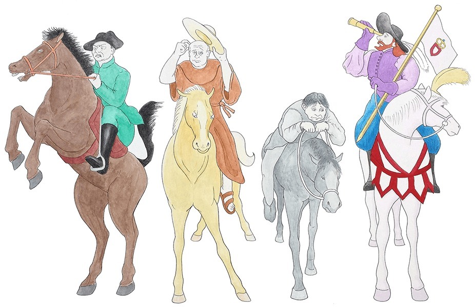
Frustration, Confusion, Disappointment, and Distraction (FCDD for short). Commissioned artwork by Elias Langner.
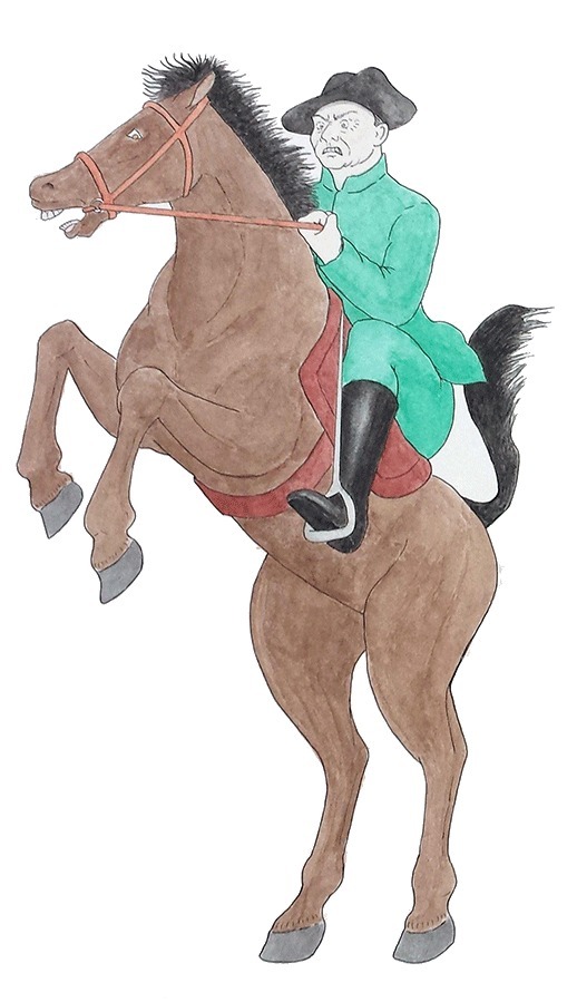
Frustration
Frustration happens when customers have reasonable expectations about how the ideal process will go, these are sadly broken. Tasks are difficult to complete.
“I wanted to contact the company, but they wanted me to fill out a huge form with 15 questions.”
“I wanted to check out, but they kept rejecting my password for not fitting into their password rules.”
“I wanted to change my settings, but I can only change my settings from my cell phone on a Wednesday.”
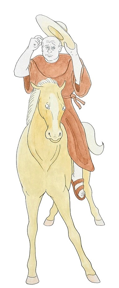
Confusion
Confusion is another broken expectation. Your visitor expects that there is something they can get done, and then learns they can’t… at all or not easily.
“I wanted to transfer money out of my account, but couldn’t find the page that would let me do that.”
“I didn’t sign up because I wasn’t sure about the differences between the regular and premium packages.”
“I did a search, but the search results seemed disorganized… it was hard to find what I really wanted.”
“The name at the top of the page on the home page was not the same name on the top of the page when I got to their products… am I still on the same company site?”
“I have no idea what I pressed but now my computer reads me everything on the screen. How do I turn that off?”
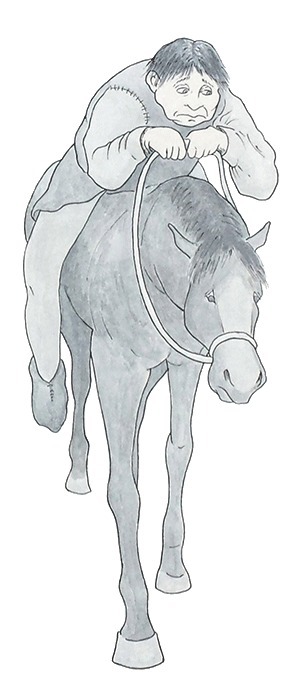
Disappointment
Disappointment is another broken expectation. Your potential customer is trying to do something and hits a wall or dead end.
“I thought I was going to be able to change my address online, but it turns out I have to call the company.”
“I filtered my search results by my size, but the item detail page said it wasn’t available in my size.”
“It told me I could buy tickets by where I wanted to sit, but that feature looked disabled.”
“I took their little quiz, but it said they didn’t have enough information to estimate how much I’d need to retire. What a waste of my time!”
“Customer service finally got back to me, but it sounds like they can’t figure out my problem.”
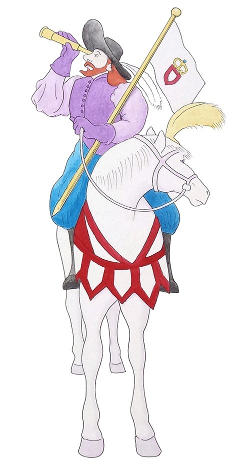
Distraction
Distraction is where the most eye-catching thing on the page and what someone is trying to accomplish on the page are not in harmony. Making things eye-catchy or cool should support customers’ goals rather than working against them. Dropping things into side columns is no excuse. Distractions can also be anything that delays a user from accomplishing their task or pulls their attention away from what they wer here to do.
Many elements could be distracting to the user.
- Your colors.
- Popups trying to get people to join mailing lists.
- An animated element.
- A carousel.
- A background video.
- Too much junk before the “Add To Cart” button or key Call To Action.
If it’s not enhancing the experience and helping people get where they wanted to go, it’s probably a distraction.
The Four P’s of Vanquishing The Four Horsemen of Bad CX and UX
By Delta CX and Ira Wolfe.
Proactive, Predictive, Pragmatic, and Problem Solving
The Delta CX model (and all of our materials and training) remind us of the risks we run when we allow The Four Horsemen to appear in our PSE. Great CX and UX practitioners exhibit these Four P’s (and many other important characteristics) that will help your company build more customer value into PSE while improving internal efficiency, communication, and processes.
We must stop measuring PSE with quantitative metrics like velocity or “is it working software.” If it doesn’t solve the users’ problems and needs, the customer might see it as broken or a failure. KPIs, success criteria, and other metrics are important, but we must stop focusing on them as our only or key measurements.
CX/UX practitioners should collaborate with cross-functional teammates to decide what we’re measuring and how we measure it, making sure to research and focus on deeper research with real and potential customers.
Training and Workshops
Our training and workshops include memorable and actionable models like The Four Horsemen of Bad UX. Get in touch with us today about speaking or training at your event or company. Workshops can be customized for your audience and needs.
